konveau.png

Konveau

"An Event Experience Powered By Personality Science. A Konveau (pronounced convo) is an innovative event experience that makes meeting others simpler and more enjoyable. Konveaus are different from regular networking events and Meetups because they are powered by the Konveau mobile web app."  

Brief:

Create a modern simple UI that reflects the Konveau message. Document UX issues with the current mobile web app. Develop a prototype and screens to be used in upcoming mobile app. 

My Role:

I assumed the Product Manager role for this project. As the point of contact between the client and a team of 4 designer, I had to develop a strategy and divide assignments to my 3 person team. I created the initial user flow and site map, as well as the Sketch Mockups and final Prototype.

The Konveau app provides attendees with: 

  • Personality descriptions for each attendee
  • Their personality compatibility with each attendee
  • Conversation starters tailored to each attendee's personality type
  • Each attendee's interests, hometown, and profession.

 
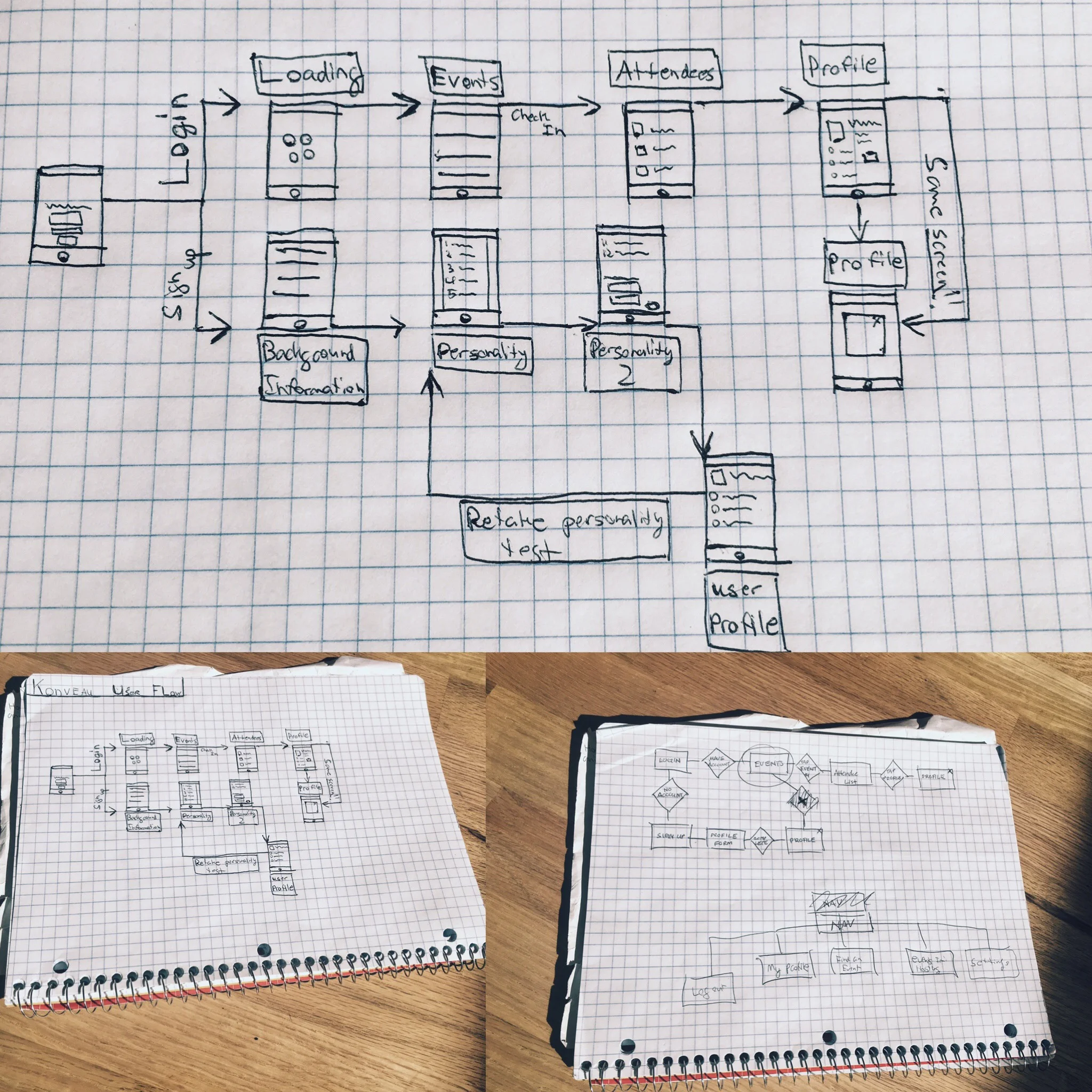
User Flow

User Flow

The original web-based app had a clear user flow. As a result, me and my team simply had to separate and expand on the main parts of the app (ie. Personality Assesment, Events, Profile, and Connections) in order to build the wireframes 

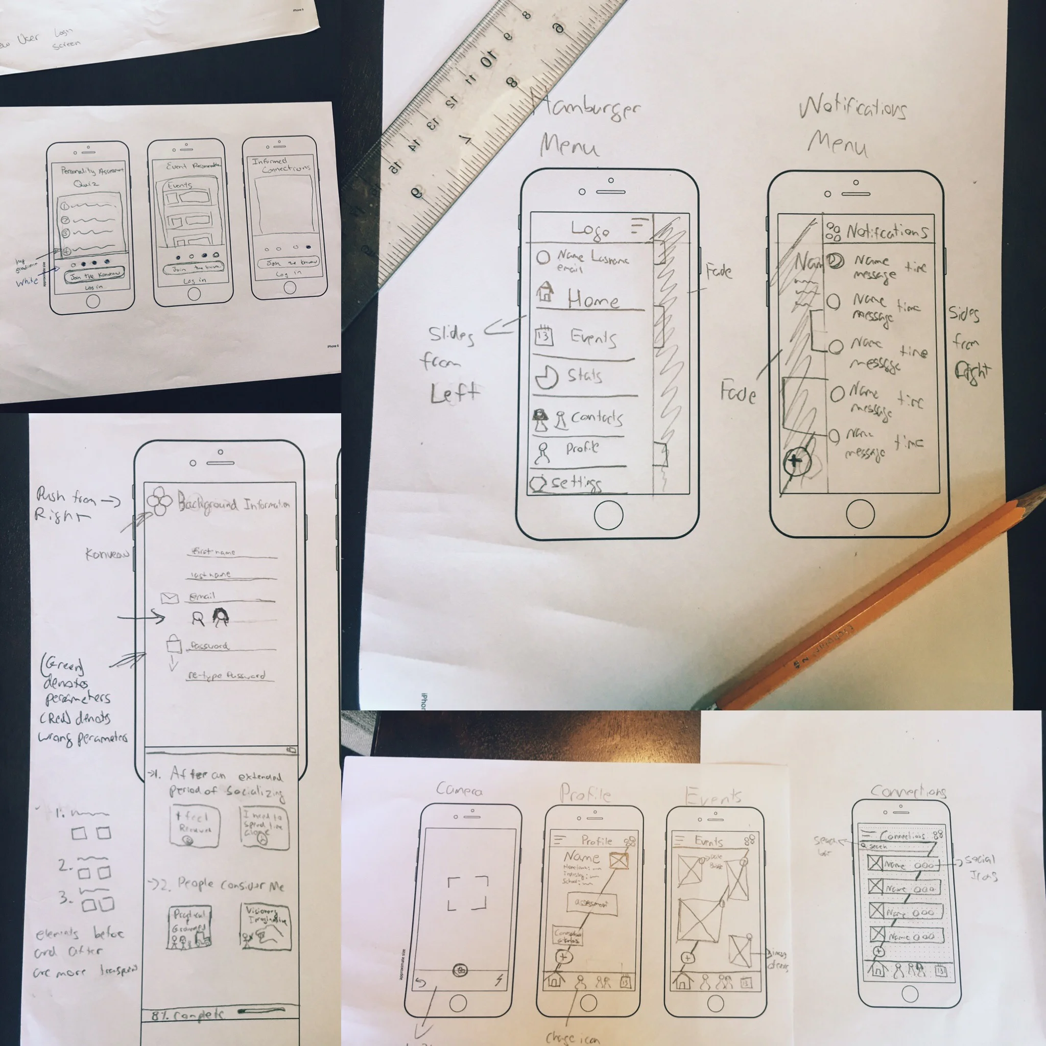
Wireframes

Wireframes

My team developed wireframes for the app to give a sense of the layout, user interactions, and animations.

Konveau App Mockup

Konveau App Mockup

The final app uses a simple 4 color scheme to identify its 4 main parts (ie. Personality Assesment, Events, Connections, and Profile.) Three Font types were used throughout to help keep the app unified and easy to read. The app includes elements of Material design specifically in the animations, content hierarchy, use of shadows, and typography.  

Konveau App Prototype

I used the app Flinto for Mac to create the interactive prototype. The animations help guide the user through the flow of the app. For example in the Personality Assessment part of the app, the previous/next questions are grayed out so the user clearly understands which questions he/she must answer at present. Minor things, like the fact that the gold color represents that a task has been completed, help the user to engage with elements of the app confidently.